The new Twentyfourteen WordPress theme is nice, but if you’re using featured images on your post, it shows theme just over the post title without adapting them if they are too small. Of course when you change a theme you cannot re-edit all the post to adapt them to the new theme.
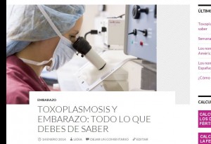
So with a small change in the CSS it’s possible to adapt the old images moving from that layout (with part of the area shaded)
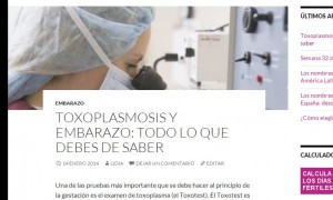
to this one:
where the images has been stretched and the image area lowered to keep the article first paragraph “above the fold”.
The CSS code can be added at the end of the style.css of the theme (but it will be overwritten) or creating a child theme (lot of work for who don’t know what I’m talking about).
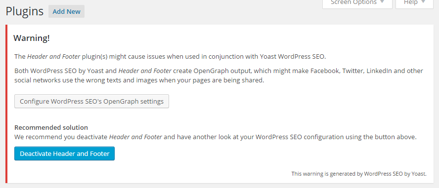
Or, using Header and Footer plugin, the code can be injected directly in to the pages without touching the theme. The code is:
<style>
#content .post-thumbnail {
height: 250px;
overflow: hidden;
}
#content .post-thumbnail img {
min-width: 100%;
}
</style>
To add this code with Header and Footer, just copy it on the option “code to be added on the head of every page”.
Simple and effective.
I’ve just used this technique on a friend’s website, Embarazo y Fertilidad, since she has articles with not well sized images for that theme and it was looking very ugly.
Another thing I changed on Twentyfourteen theme for that site, is the archive pages: I don’t like to have the post listings with all the post content and since the “more” tag was not used make the archive pages to use the auto generated excerpt. The WordPress guys should definitively add an option to let the blog owners if they want the full content or the excerpt for archives!


